What Makes the Best Med Spa Websites in 2026 (With Examples)
Search “best med spa websites” and you’ll find plenty of pretty screenshots. But beautiful and effective aren’t the same thing. The best med spa websites in 2026 share a specific set of traits that turn browsers into booked consultations. Here’s what to look for — and how to apply it to your own site.
What separates the best from the rest
1. A premium first impression
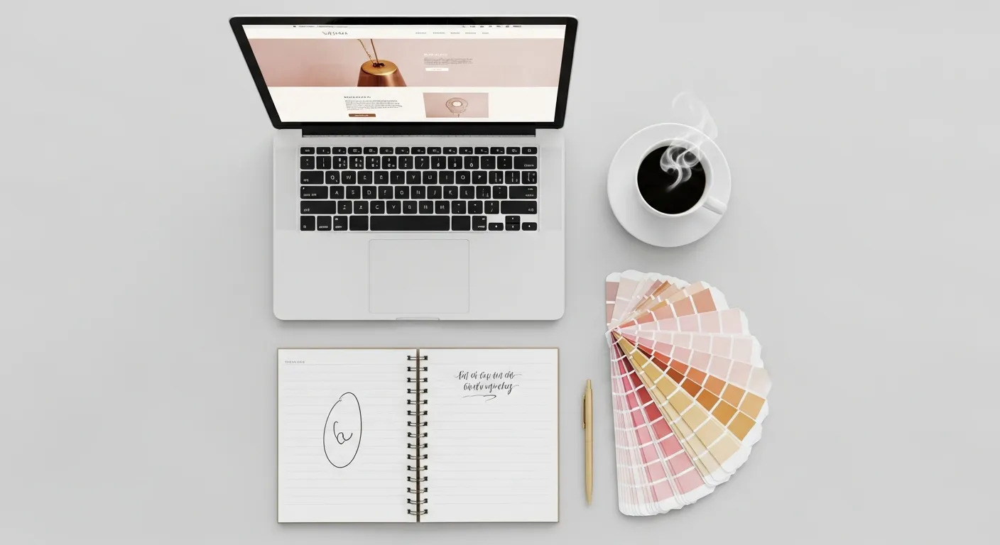
Your website is the digital version of walking into your clinic. The best sites feel calm, elegant, and high-end within the first second — clean typography, a refined color palette, generous whitespace, and a striking hero image. That perceived quality is what justifies premium pricing.
2. Designed to convert, not just to impress
Pretty is table stakes. The best med spa sites guide every visitor toward one action — booking a consultation — with clear calls-to-action, trust signals, and zero friction. See our take on conversion-focused med spa web design.
3. A page for every treatment
Top sites never bury services on one page. Each treatment gets its own detailed page — which is also what lets them rank on Google for specific searches like “lip filler [city].“
4. Real proof
Before/after galleries, genuine patient reviews, provider credentials, and specific results. Trust is built with evidence, not adjectives.
5. Fast and mobile-first
Most patients visit from their phones. The best sites load in under a second and feel effortless on mobile — because every second of delay quietly costs bookings.
6. Effortless booking
Online scheduling on every page. The best sites assume a patient might be ready to book at any moment — and never make them hunt for how.
A look at standout concepts
To show what these principles look like in practice, here are a few med spa website concepts we’ve designed — each with a distinct style, but all built on the same conversion fundamentals:
- Lumière Aesthetics — a warm, editorial split-layout that feels boutique and refined.
- Glow Medical Spa — a bold, full-screen, image-led design with a single clear call-to-action.
- Aura Skin Studio — a sleek, dark, high-fashion look for a luxury positioning.
- Serenity Med Spa — a soft, rounded, wellness-forward aesthetic.
You can see these and more in our portfolio of med spa website designs — notice how each looks completely different, yet every one is engineered to book patients.
How to apply this to your site
Audit your current website against the six traits above. If it falls short on speed, treatment pages, proof, or booking, those are your highest-ROI fixes — and they matter more than a redesign for its own sake. (Wondering what an upgrade costs? Here’s our med spa website pricing guide.)
Want a website on this list?
We design med spa websites that look luxurious and perform. Get a free audit of your current site and we’ll show you exactly what to change to turn more visitors into booked patients.
Frequently asked questions
What makes a med spa website 'good'? +
A great med spa website pairs a premium, on-brand design with conversion fundamentals: fast load times, mobile-first layout, a page per treatment, real before/after proof, trust signals, and an obvious way to book on every page.
How many pages should a med spa website have? +
At minimum: a homepage, an about page, a page for each major treatment, a results/gallery page, reviews, and a contact/booking page. Treatment pages are what let you rank for specific services on Google.
Should a med spa use a template or a custom website? +
Templates are fine for testing, but the best-performing med spa sites are custom — they look unique, load faster, and are built around your specific treatments and conversion goals.
Want a med spa website that books more patients?
Get a free, no-obligation audit of your current site — with a clear plan to grow your bookings.
Get my free audit